
For years, Windows 10’s taskbar was the yardstick that unhappy Windows 11 users kept holding up. Every time Microsoft added something new to the taskbar and stripped something old away, someone in the comments would say, “just go back to Windows 10.” Now that Microsoft is finally restoring features it cut in 2021, I put both taskbars side by side on separate machines to see how much ground Windows 11 has recovered, and where it still falls short.
Since I value your time, the short version is that Windows 11’s taskbar is shaping up to be close to Windows 10’s at this point, closer than it has ever been. But the way you interact with each one still tells a different story, and a few gaps remain that I’m not sure if Microsoft has plans to cover.
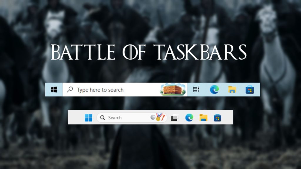
Taskbars in Windows 10 and 11 look very different out of the box
The obvious thing that anyone oblivious to Windows 11 first notices when they “upgrade” to the newer OS is that the Taskbar has icons centered by default. Windows 10, like all previous versions of Windows, had its taskbar icons left-aligned. Microsoft made the switch in 2021 and triggered an enormous backlash.
But truth be told, when I saw the announcement, I was waiting to try out the centre-aligned taskbar, just to experience something different from Windows.
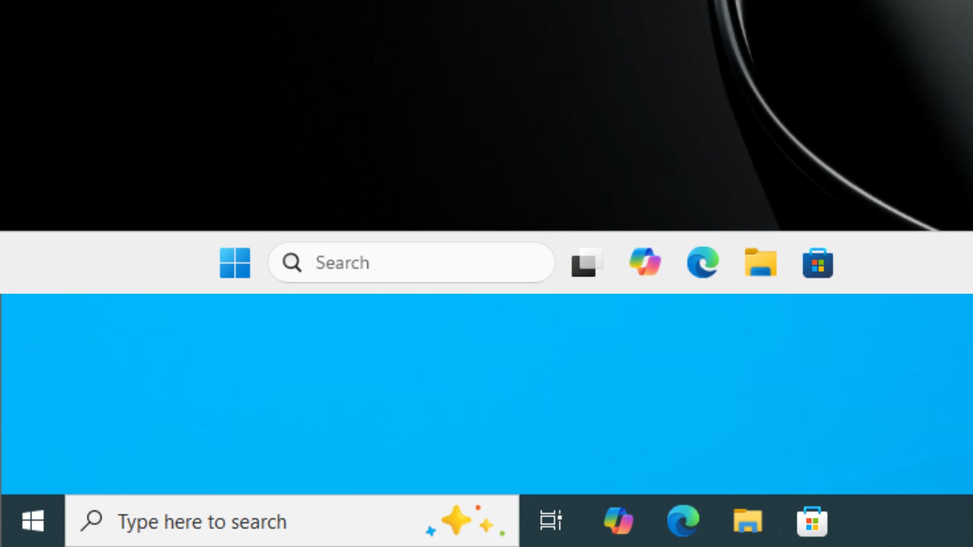
Windows 10 also places a wide “Type here to search” bar in the taskbar, which takes up a visible chunk of horizontal space. Windows 11 replaced that with a compact search button or a narrower search box, depending on how your settings are configured.
The more consequential out-of-the-box difference, though, is the right-click menu you get with the Taskbar in both versions. While Windows 11 keeps it minimal and forces you to go to the settings to change any aspects of the Taskbar behaviour, Windows 10, conveniently, gives you a ton of customization in its taskbar, right from the right-click menu!
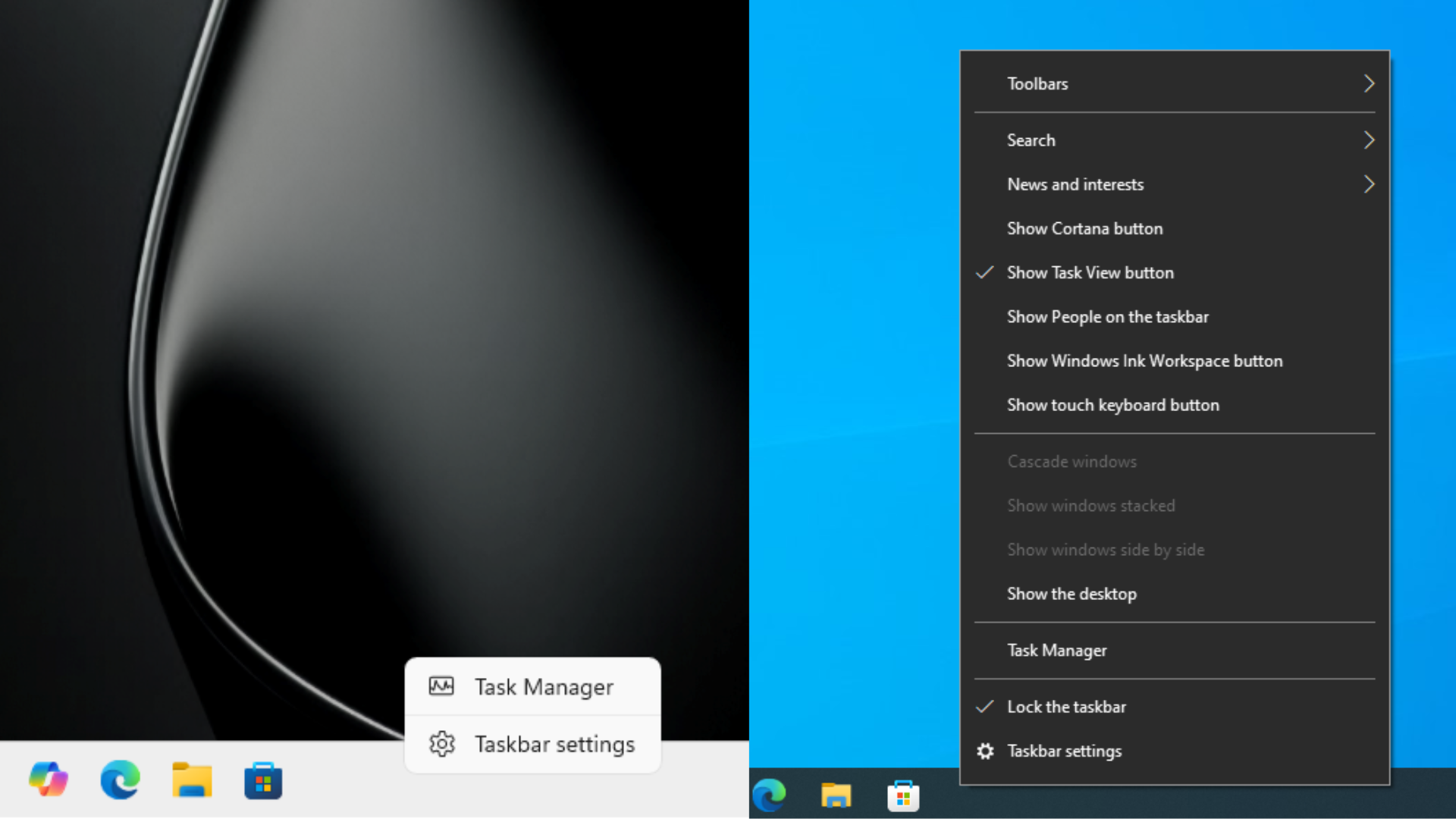
Do I like the rounded corners and cleaner look of the right-click menu in Windows 11 taskbar? Yes, I absolutely do. But I can’t help but miss the easier and more powerful customizations that could be done in Windows 10 taskbar, without having to go into the Settings, and the customization options here make the newer version look shamefully underpowered.
Starting with Toolbars that allow you to add links directly to the taskbar (good, if you have specific sites you visit often). Then you can customize Search by hiding it, showing just the Search icon, hiding the animated search highlights, and even disabling Open on hover, which most people likely have unchecked.
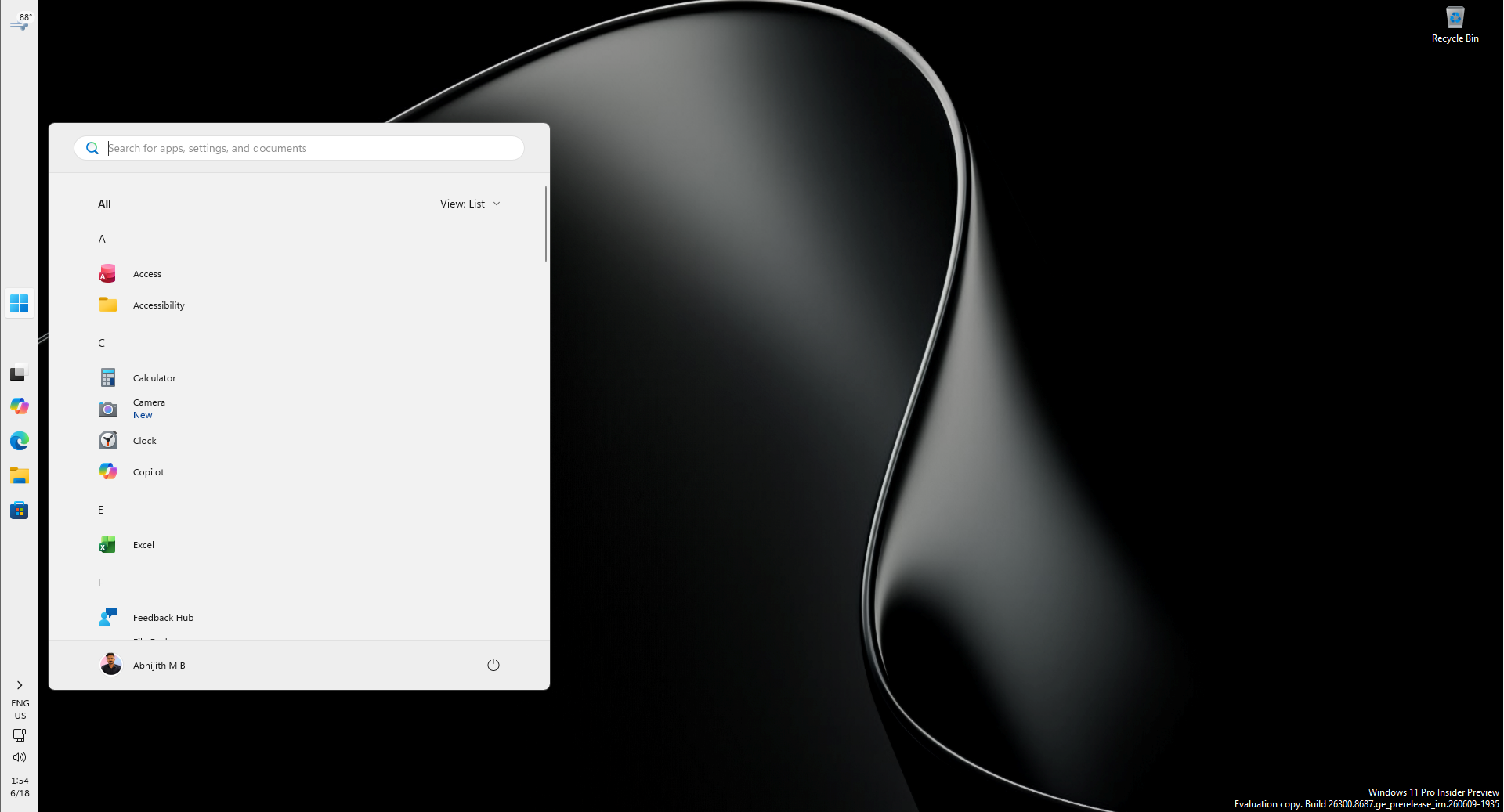
Meanwhile, in Windows 11, you can’t even right-click the Search bar. Any change you want to make in the Search bar requires you to click on it, select the three dots, and then click Search settings, which will open the Settings page for Search.
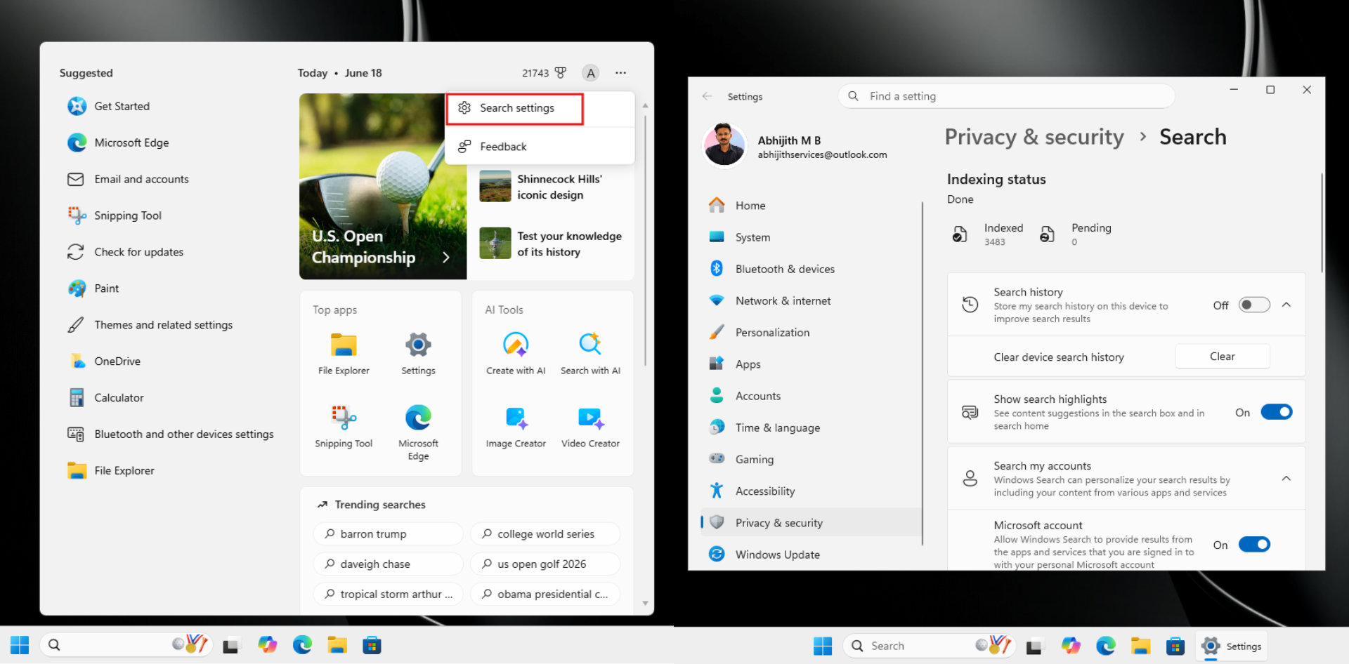
Of course, that’s about the same amount of customization for both, but unlike the OS that has reached the end of support, Windows 11 will soon get an option to entirely hide Bing web results in Search.
Back to the battle of the taskbars, something that many users with smaller screens were annoyed with in Windows 11’s taskbar was its height. Windows 11’s taskbar is noticeably taller than Windows 10’s default, which already eats into vertical screen real estate. As someone who likes smaller laptops with 13- or 14-inch displays, I found it annoying that I couldn’t change the taskbar size in Windows 11. But now, there is good news!
Taskbar size – Windows 10 had a toggle, Windows 11 just got one back
Windows 10 has had a “Use small taskbar buttons” toggle for as long as most people can remember. Flip it on in Settings > Personalization > Taskbar, and the taskbar immediately snaps to a noticeably shorter height. The clock, system tray icons, and pinned app buttons all scale down together. I always enabled it on all Windows 10 devices I had.
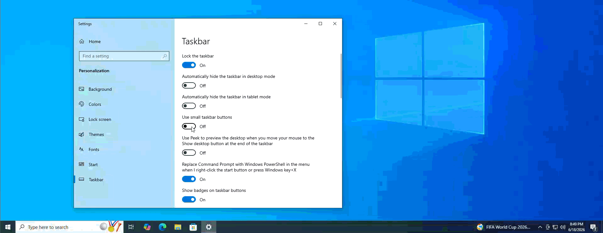
Windows 11 removed this when it launched in 2021. I was furious as there was no toggle, no compact mode, no workaround without a registry hack. There was, however, an option that would make the Taskbar icons smaller, but the Taskbar itself had the same vertical height!
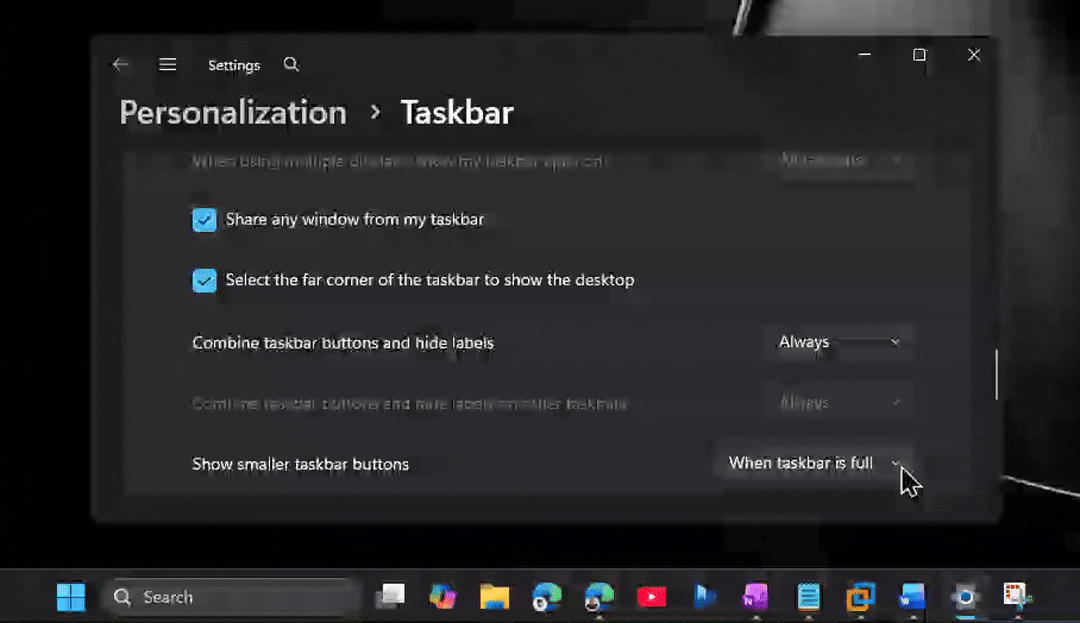
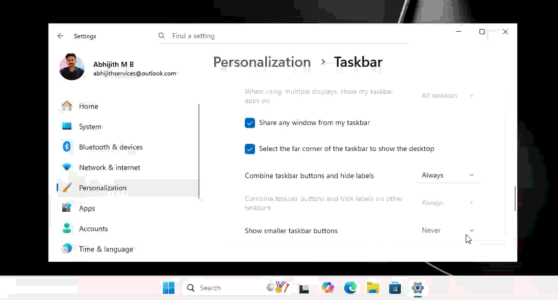
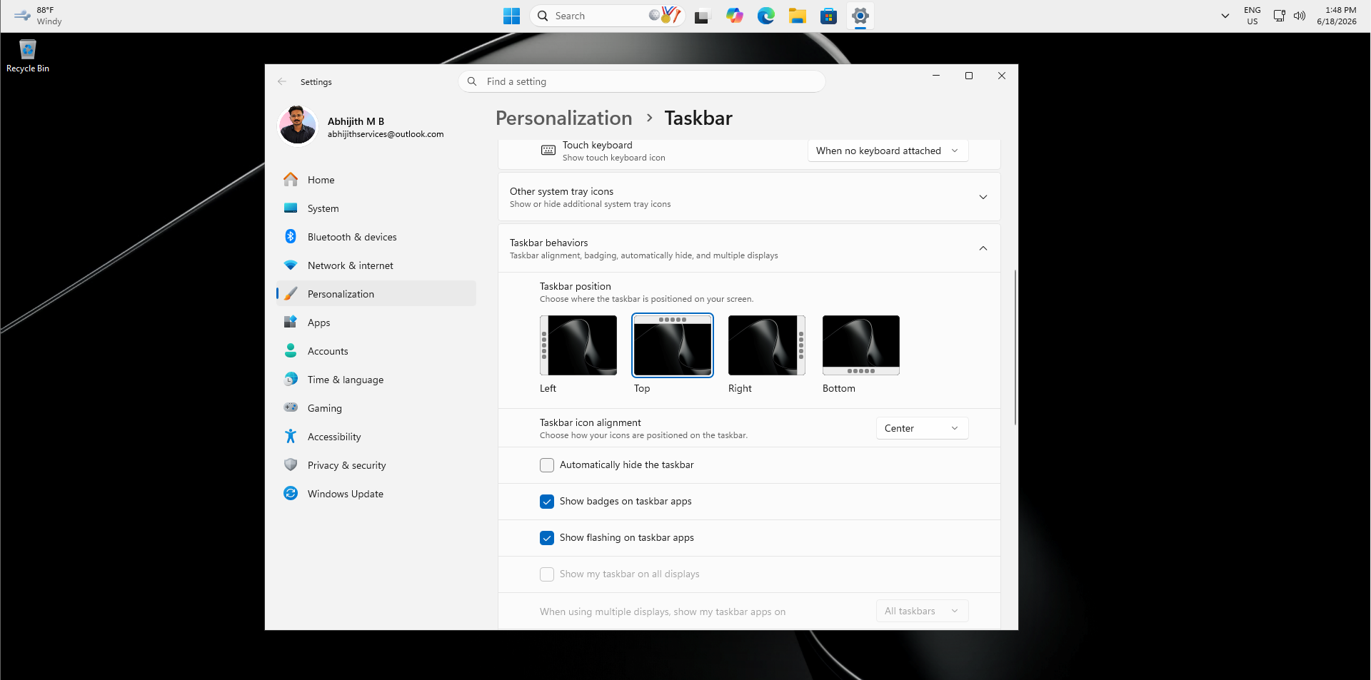
Fortunately, after years of feedback, Microsoft has now made this option such that it makes the entire Taskbar smaller. You will find it under Settings > Personalization > Taskbar > Taskbar behaviors, labeled “Show smaller taskbar buttons” and it defaults to Never.
One difference worth noting is that Windows 10’s toggle is binary – on or off. Windows 11’s implementation has slightly more granularity, which could suggest more size options down the road. For now, both behave similarly once enabled, shrinking the bar and its contents proportionally. The key thing is that after five years, the option is back.
Repositioning the taskbar in Windows 10 and Windows 11
Now, the part that gives the crown to Windows 10, and shows that the old taskbar is faster, lighter, and more efficient.
Repositioning the taskbar on Windows 10 takes about two seconds. You hold-click on an empty spot on the taskbar, drag it to the top, left, or right edge of the screen, and it snaps into place. There is no need to go to the Settings page. It is a first-class interaction that has been in Windows 10.
Many users considered a different taskbar position as part of their identity, and it was shocking to see that Windows 11 dropped this in 2021. Microsoft argued that moving the taskbar caused layout disruptions for apps because when the taskbar shifts to the left or right, every application on the screen has to reflow its layout. Windows 11’s architecture, which was rebuilt from scratch rather than carried over from Windows 10, made this more engineering-intensive than it sounds.
After five years of waiting, Microsoft has now shipped the ability to reposition the taskbar in Windows 11. Both OSes now support the same four positions: Bottom, Top, Left, and Right. On Windows 11, you change this through Settings > Personalization > Taskbar > Taskbar behaviors > Taskbar position, where a visual four-way picker lets you choose. Drag-and-drop repositioning has not shipped yet, so the gap between Windows 10 and Windows 11 on this specific interaction still exists.
In my opinion, Windows 11’s version looks slightly better, but for some reason, it feels incomplete. Windows 10’s taskbar, despite looking like older software, feels more polished.
Note that the new Start menu I’m showing here in Windows 11 is the version in the latest Insider builds that can individually turn off pinned apps and recommendations, which is what I did here.
Microsoft is also testing per-monitor taskbar positioning for Windows 11, which would let you put the taskbar at the bottom on your primary display and the top on a secondary one. Windows 10 has no equivalent, and every monitor inherits the same position setting, so Windows 11 could eventually go beyond what Windows 10 offered here.
Combining taskbar buttons and hiding labels in Windows 10 is better than in Windows 11
In Windows 11 taskbar, by default, app icons will be combined with their label hidden. You can see this option by going to Settings > Personalization > Taskbar > Taskbar behaviour:
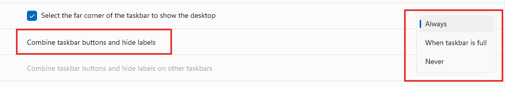
Always is selected by default, so your open apps will look like this:

Some users prefer to use When taskbar is full or Never, and selecting these would show the full label of the apps:
![]()
This is useful when you need to open multiple instances of the same app. For example, if you have two Excel sheets open with different names, it would be easier to find which one is which, from the label, and just a single click is enough. Else, you’d have to hover over Excel and select the required Sheet.
![]()
Of course, Windows 10 also has this:
![]()
Right off the bat, Windows 10’s version looks slightly cleaner with the line below each app label instead of the dot just under the icon in Windows 11. But that’s not the issue, if your taskbar gets full, or like me, if you choose Always and don’t like to show the labels, the experience is different on both OSes.
![]()
In Windows 11, you’ll see just one short pill under Edge, but there are actually three instances of Edge open, and ideally there should’ve been three short pills stacked under Edge, letting me know that there are three instances open. As shown below, Windows 11 shows stacked icons only when I hover over the particular app, which just defeats the purpose, because by the time I hover over it, I would already be greeted with the open instances of the app.
Now, look at how Windows 10 does it:
![]()
You can clearly see the stacked lines under Edge, telling me that multiple instances of the app is open, and I wouldn’t have to remember if I closed anyone of them. It’s the little things like this that makes us realise that a lot of thinking went into designing Windows 10 and I wonder if Windows 11 was rushed to the market.
Words can’t explain how different the Start menu experience is
Of course, the biggest and most important part of the taskbar is the Start menu, and both versions of Windows had completely different ideas.
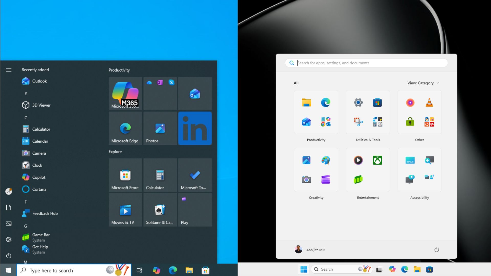
Windows 10’s Start menu has been resizable since Windows 10 Fall Creators Update. You can drag the top edge to make it taller or shorter, drag the right edge to change the width, and you can even grab the upper-right corner and resize diagonally in one motion.
Windows 11 launched in 2021 with a Start menu that was locked to a fixed size, and until now, there has been no official way to change it. Microsoft is now testing a resizable Start menu for Windows 11 in Insider Preview builds, but rather than the free-drag interaction Windows 10 offers, Windows 11 introduces preset Small and Large size options. The fluid, pixel-by-pixel drag-resize that Windows 10 has had for years is not coming back to Windows 11, as of now.
Windows 10 also shipped with Live Tiles that showed real-time content like weather, news headlines, calendar events, and app notifications. Some people loved them, some hated them, but the point is, they were there, and looking back, I feel they had much more potential.
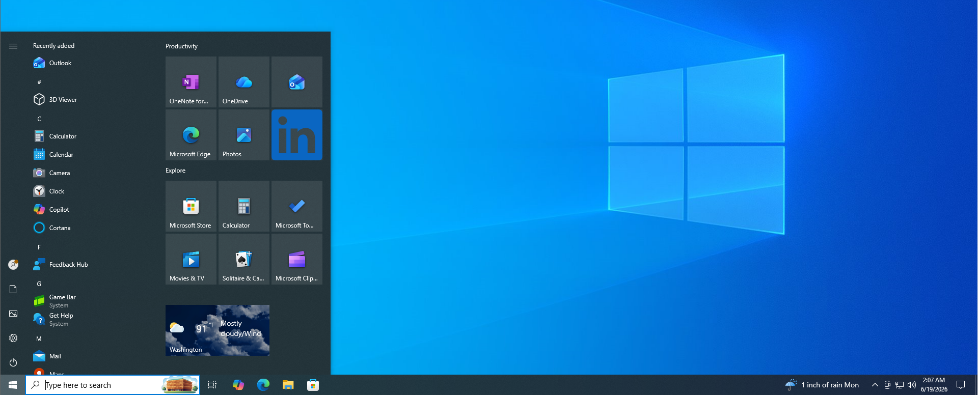
Windows 11 removed Live Tiles on day one, replacing them with a pinned apps grid and a Recommended section below it. Nothing in Windows 11’s Start menu shows live information the way Live Tiles did. Based on some design ideas that Microsoft had for the Start menu, Widgets could’ve been the next step for Live Tiles.
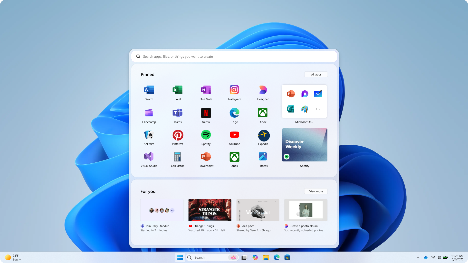
On balance, Windows 10’s Start menu still gives you more control over how it looks on your screen.
News and Interests vs Widgets
Windows 10 shipped News and Interests in 2021, which is a weather icon that expanded into MSN cards. It was a WebView2 application running up to seven msedgewebview2.exe processes in the background. Not a good feature, but one right-click and a left click turned it off completely.
Windows 11’s Widgets board was more capable on paper, but far more aggressive. Hovering near the Widgets button threw open a full panel of MSN news and ads mid-workflow. Multiple redesigns followed, none addressing the core complaint. Microsoft has only recently turned off “Open on hover” and disabled taskbar badging by default. News and Interests was bad. Widgets made the same idea impossible to ignore.
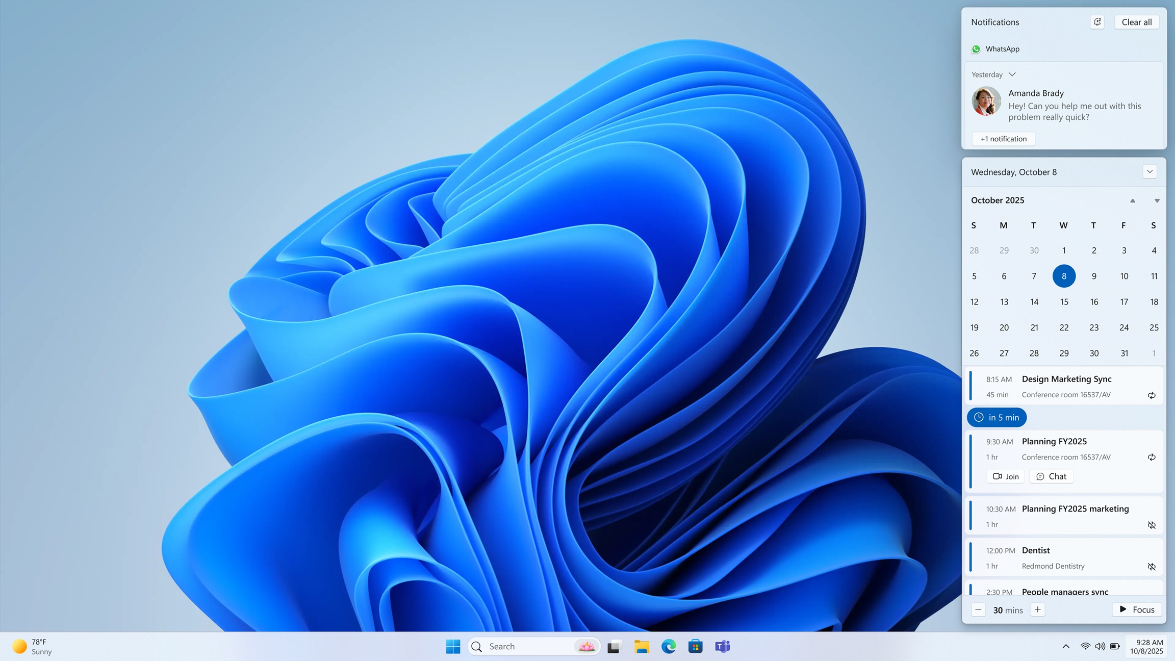
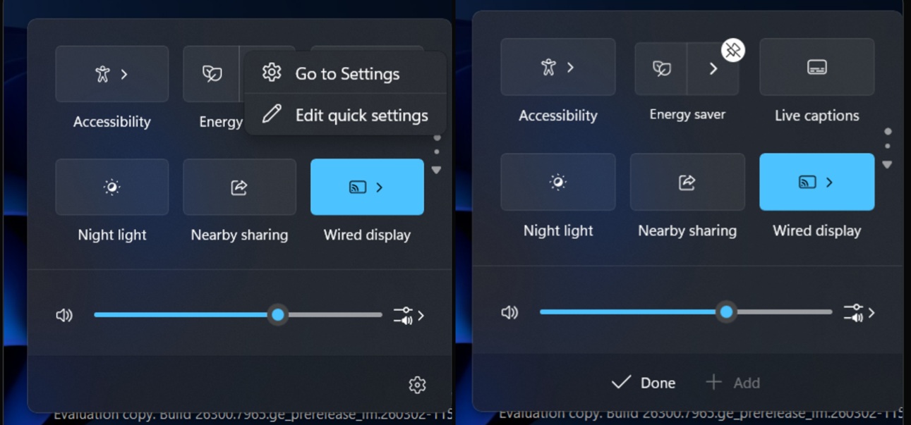
Quick Settings and the notification centre
Windows 10’s Action Center puts quick toggles and notifications in one panel, but clicking Wi-Fi or Bluetooth sends you to Settings to do anything useful.
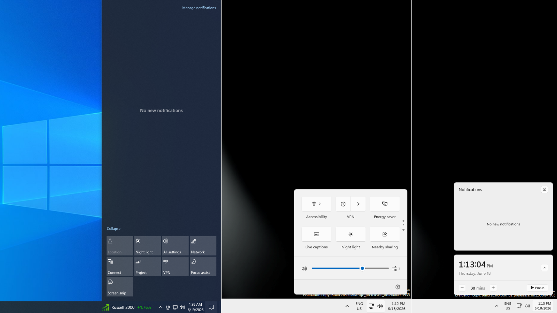
Windows 11 split this into two flyouts. Quick Settings lets you switch networks, pair Bluetooth devices, and adjust brightness and volume without leaving the panel. Tiles are customisable, and new features slot in automatically. On this front, Windows 11 wins clearly.
The clock flyout is where Windows 10 pulls ahead. Clicking the clock showed your calendar and, with Outlook connected, we had a native agenda of upcoming meetings.
Microsoft deliberately removed this from Windows 11 at launch. The Agenda view is returning, but it runs on WebView2. Windows 10’s agenda was native shell code, and not a RAM hog.
The battery indicator is one area where Windows 11 is unambiguously better. Windows 11 now has colour-coded battery icons with green for charging, orange for Energy Saver, red below six percent, plus a persistent percentage you can enable in Settings. Windows 10 never had this.
![]()
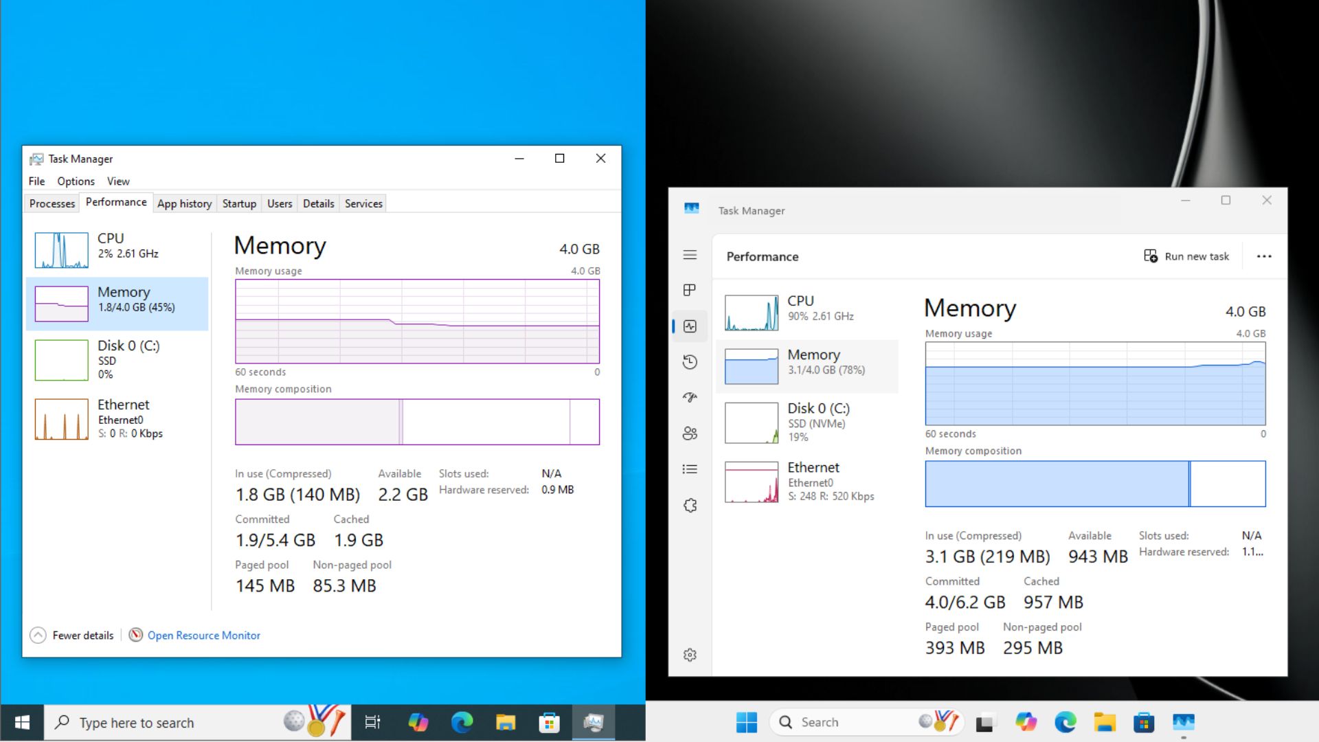
Windows 11 has a performance trick for taskbar flyouts that Windows 10 never needed
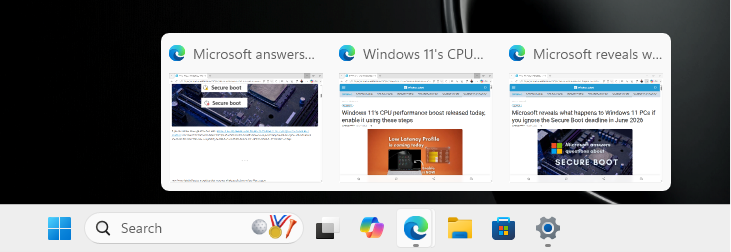
Every flyout from the taskbar required Microsoft to build Low Latency Profile to make them feel snappy. It shipped with the June 2026 update (KB5094126) and works by spiking the CPU to maximum frequency for one to three seconds whenever you open a shell element, bypassing the scheduler’s ramp-up delay.
Our testing found up to 70% faster shell responsiveness on budget hardware. Microsoft is also rewriting Quick Settings to make it faster.
Windows 10 never needed this. Its Action Center, clock flyout, and system tray were native Win32 shell code. A budget PC opened them without hesitation because there was no WebView2 layer or XAML rendering between the click and the result. The fact that Windows 11 needed a dedicated CPU scheduling feature to make its own Start menu feel responsive is the most honest measure of how far the performance gap grew. Microsoft is closing it fast, though.
What Windows 11 still has that Windows 10 does not
After all the comparisons, a few things in Windows 11’s taskbar are genuinely new and, dare I say, innovative. The Resume feature, visible in the Taskbar items section of Settings, shows a badge notification when you can pick up Android activity on your PC.
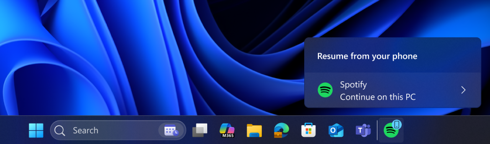
Windows 10 had no equivalent of this; the Phone Link connection between Android and Windows was far more limited in that era, even though we were supposed to have something even more powerful with Windows 10 Mobile’s Continuum.
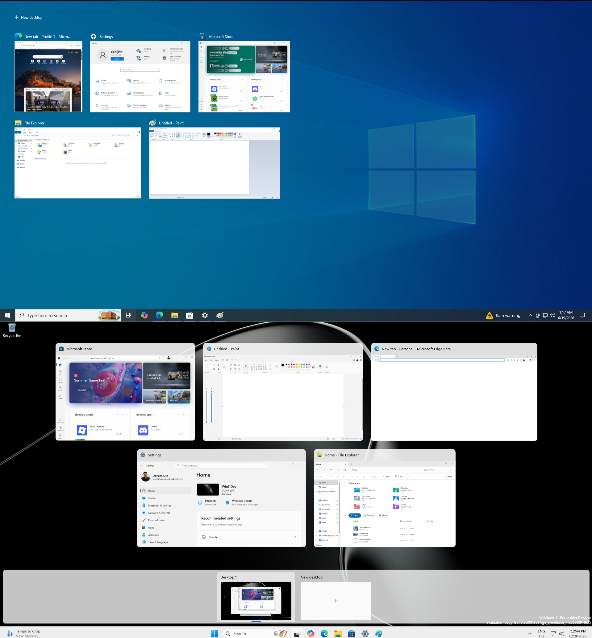
Task View in Windows 11 taskbar is also better integrated with virtual desktops than the Windows 10 version ever was. Switching desktops feels smoother, and the visual layout of the Task View panel is cleaner.
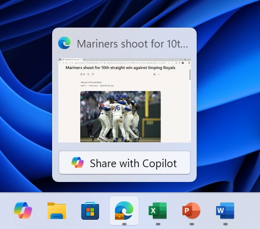
Windows 10’s taskbar, while highly configurable, had no equivalent of Windows 11’s Share window button, which lets you share any window directly from the taskbar to AI agents. I know AI from Microsoft is not something we like, but there is no point in denying where the world is headed!
What is next for the Windows 11 taskbar
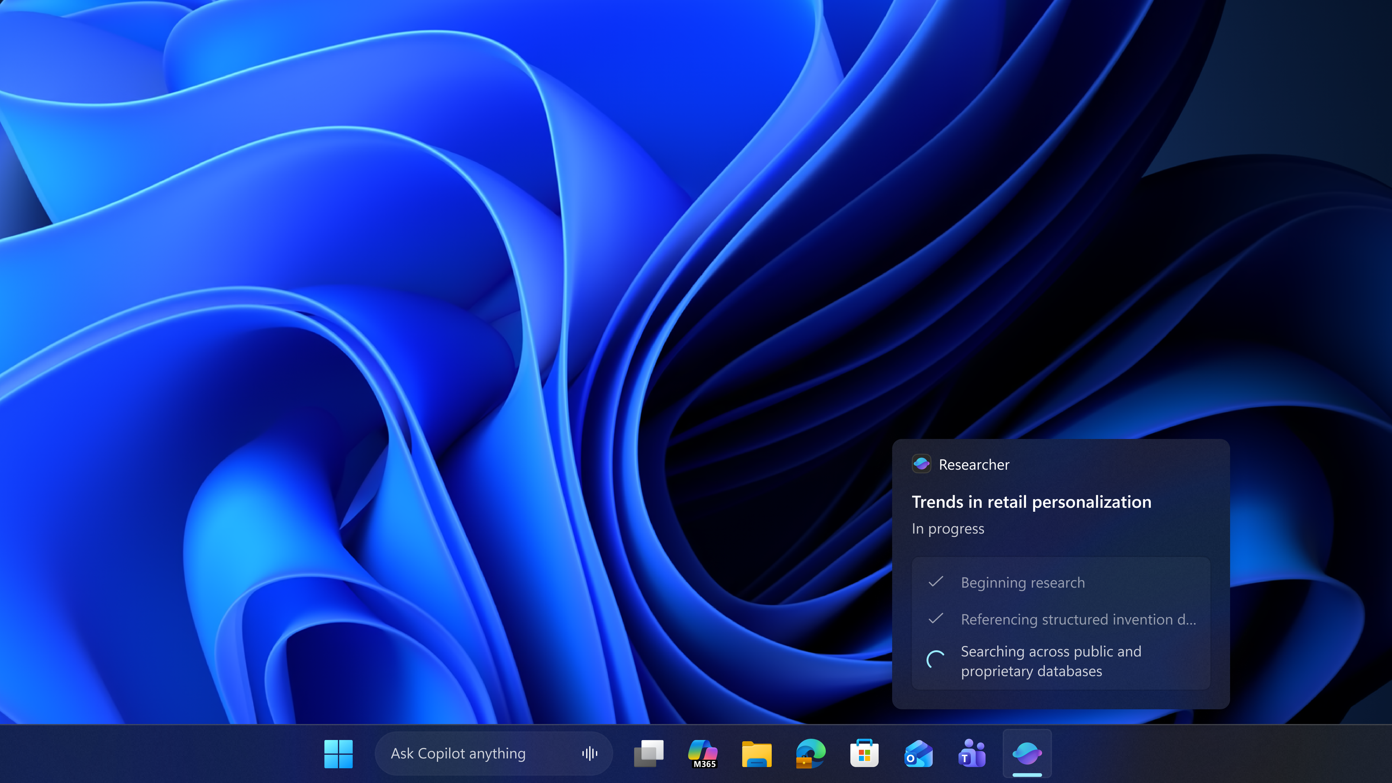
Microsoft is not done. AI agents are being integrated directly into the Windows 11 taskbar, which Microsoft has confirmed will allow you to hover over the Copilot icon in the taskbar to monitor or control autonomous agents running on your behalf. Third-party agents will also be supported. Windows 10 has no concept of this. Its taskbar was never designed around AI orchestration, and unfortunately for the software giant, most people prefer the older ways.
Then there is Ask Copilot, which Microsoft has confirmed is coming to the Windows 11 taskbar in mid-2026. The goal is to let you type a query directly into the taskbar without opening the full Copilot interface first. It also works as a replacement for Search.
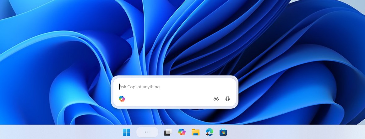
Barring the Copilot part, in my testing of Ask Copilot, I found it exceptionally fast, minimal, and distraction-free when compared to the traditional Windows Search, which is honestly a cluttered mess in its default setup.
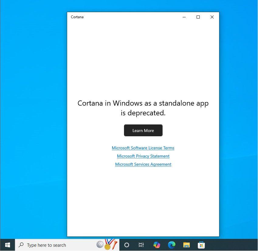
Windows 10’s search bar sent you to Edge with a Bing result, and that’s it. There isn’t any AI slop here, but there still was an assistant that lacked any LLM prowess of today’s AIs. Cortana was my favourite assistant back in the day. It sounded natural, was funny at times, and I miss it. Copilot literally sounds more like a corporate ploy. Cortana was fun and personal, though it lacked any capability of personalization.
Back to the present, or should I say the future, because Per-monitor taskbar positioning, which lets each display have its own taskbar location, is something Microsoft is actively testing, and if it ships, Windows 11 will have gone past Windows 10 on taskbar customization rather than simply catching up to it.
After five years of regression, Windows 11’s taskbar has closed most of the gap. The smaller size option is back. Repositioning is back. App labels are back. The settings page is better organized than Windows 10’s, and some new features have no Windows 10 equivalent at all. But the drag-and-drop repositioning that made Windows 10 feel natural for power users is still not there. And the AI features coming down the pipeline are going to add more complexity to the taskbar, not less. And most importantly, Windows 11 in general is not as fast or efficient as Windows 10.
Whether Windows 11 eventually feels better than Windows 10’s taskbar or just different depends on your appetite for what Microsoft is building toward. If you want a fast, lean, highly customizable taskbar with no AI layer on top of it, Windows 10 still edges it out in some real-world moments. If you are comfortable with where Windows 11 is headed, the gap has closed enough that it is no longer a reasonable argument for staying on an OS that Microsoft stopped supporting.